Wayfarer - UI Design
Background
Wayfarer is a website where travelers can discover new locations to visit around the world. Although it doesn’t directly sell any trips, flights, or accommodations, voyagers use it as a tool for researching where to travel next.
Target Audience
People from the ages of 21-30 years old who frequently travel & are in search of new adventures.
Deliverables
Redesign Wayfarer’s landing page.
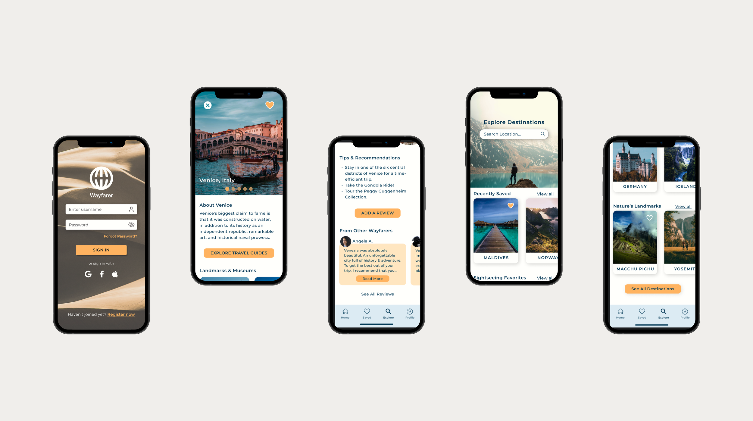
Design 3 mobile app screens:
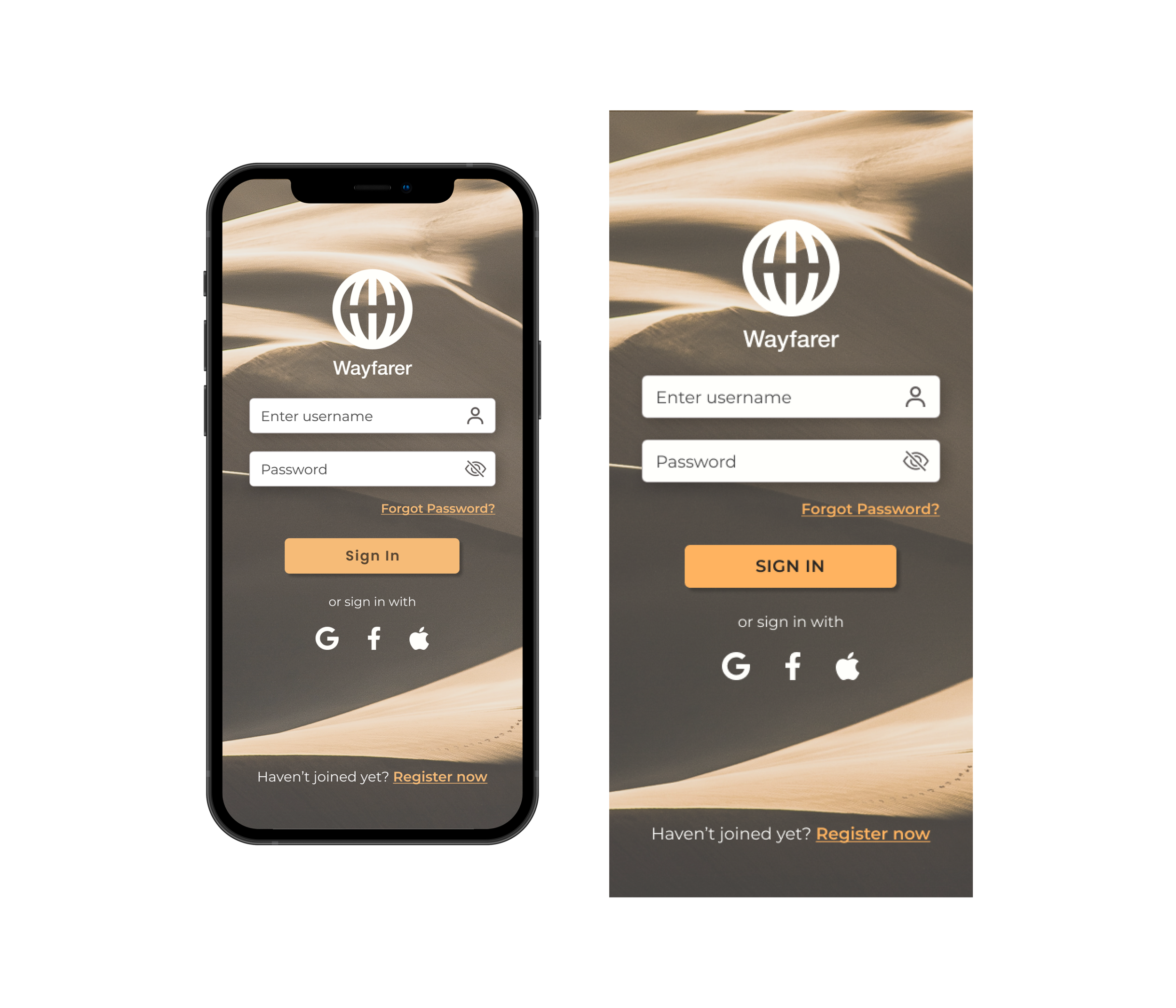
(1) A sign-in screen
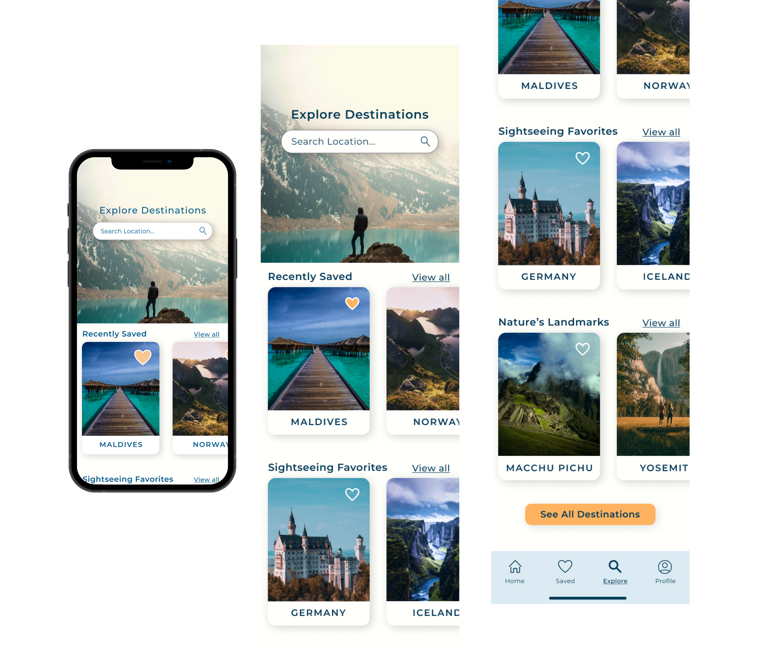
(2) overview of destinations screen
(3) a destination detail screen
-
I began by conducting secondary research on competitors such as Airbnb and Expedia. I noted Airbnb’s simple and sleek design, and how they segmented a complex library of information into a user-friendly interface.
After background research, I created multiple lo-fi sketches for the landing page and mobile screens. After vetting the potential sketches and narrowing them down, I worked on a style tile for the typography, buttons, and icons.
-
Being that this project was centered on solely UI Design, I had to work with many assumptions on my target audience and their desires and pain points. In a real-world project, I would conduct more thorough background research and user interviews before going ahead with the UI process.
I anticipated difficulty in sectioning the content in the mobile app screens. I referenced Airbnb’s mobile app for guidance on simplifying complex information and directing the user through the sections.
-
The process will surprise you. This was my final project in learning the fundamentals of UI Design. I had gone into the project with ideas and expectations - none of which matched the final look and feel of my design.
You should allocate an extra brainstorming session specifically for information-dense screens. As I anticipated, I was most challenged with the destination details mobile screen. Since this was the most content-heavy screen, I devoted a chunk of time to brainstorming how to arrange the segments of information.
Style Tile

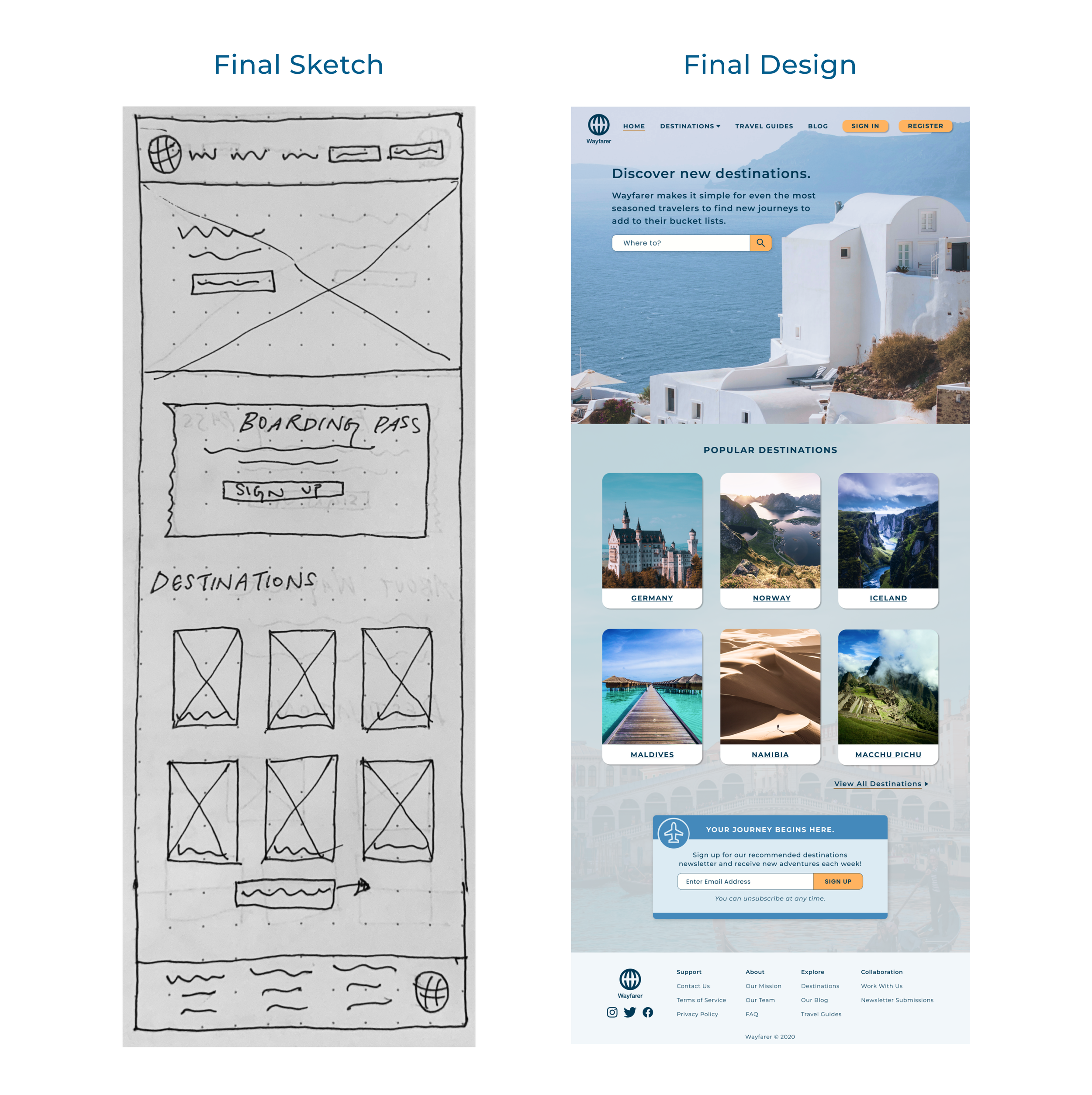
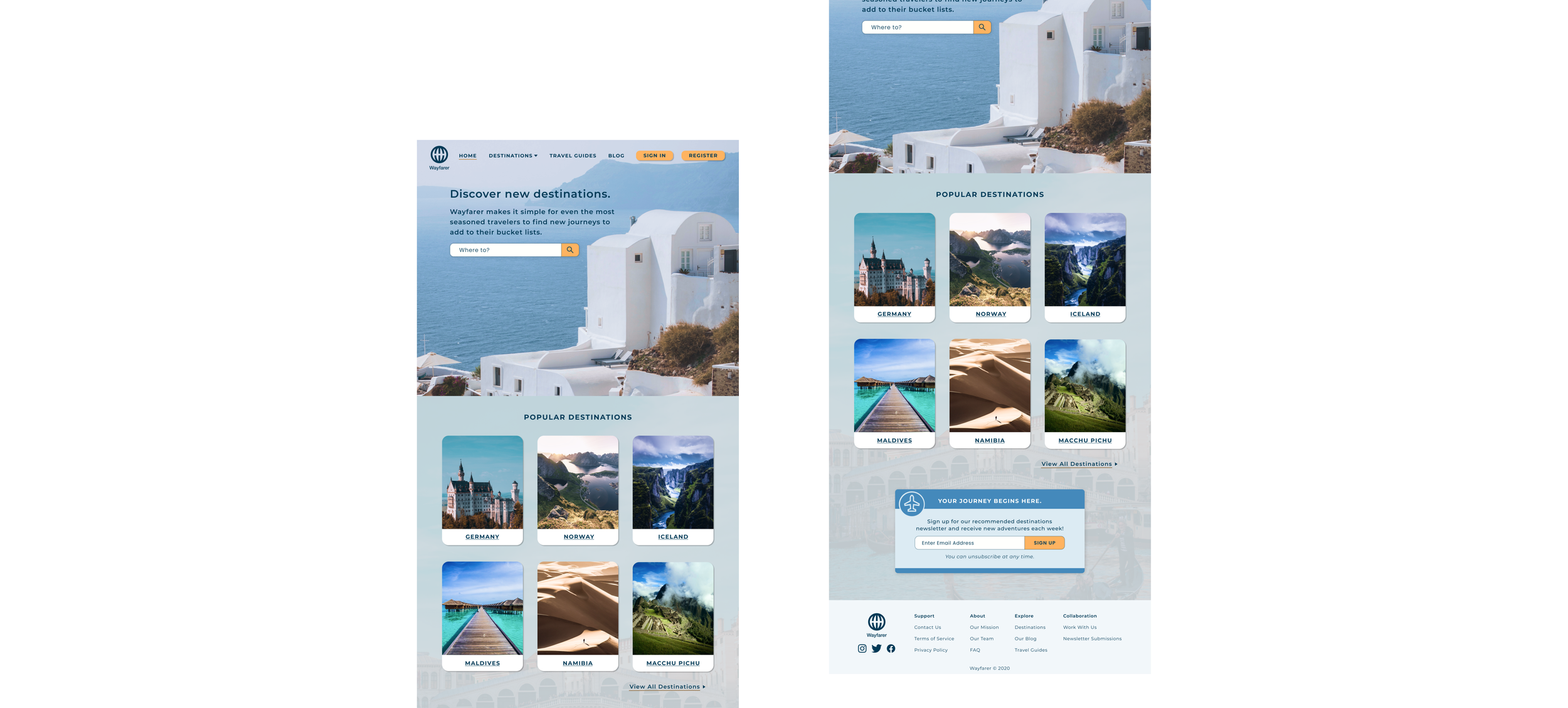
Designing the Landing Page
Elements:
Navigation Panel
Wayfarer’s Mission
Overview of Destinations
Newsletter Sign Up (CTA)
My Approach
I aimed for a simple and user-friendly design. I chose to list the overview of destinations through content cards. As writers say, I did have a “darling” when it came to the boarding pass sketch - I thought it matched the voyager’s feeling of wanderlust. If this project were to hit the ground, however, I would opt for A/B testing to see whether the boarding pass or a more standard sign-up CTA prevails.

Designing the Mobile Screens
Sign-in Screen
Destination Overview
Destination Detail Page
My Approach
For the sign-in screen, I opted for simplicity and familiarity (the option to log in through other accounts.) For the destination overview screen, I utilized the content cards from the landing page and then organized the material with a mixture of individually tailored content (Recently Saved), crowd favorites (Sightseeing Favorites), and a general section (Nature’s Landmarks).
For the destination detail page, which was the most content-heavy screen, I focused first on dividing each section and ordering them. After the area photo carousel and the short description, I placed a call to action button as a user might want to skip ahead and read the travel guides Wayfarer has before looking through the rest of the content. Finally, at the bottom, I added a “Reviews” section. I was challenged with the position of the “Add a Review” button. I didn’t want to put it near the “See all Reviews” as the two buttons would be too close. I settled with putting it on top of “From Other Wayfarers,” which seems counter-intuitive at first but I believe it is the better placement in terms of touch usage.